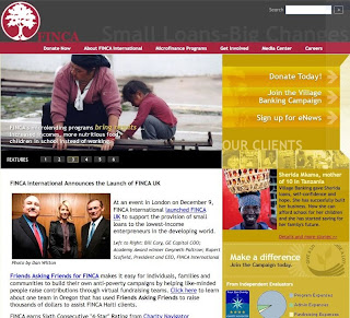
 It’s all about stories. Finca is a micro loan company. You give them some money and they loan it to people around the world who are trying to improve their lives. It’s a great organization doing vital work. Their website has good photos, but they could be even more effective if they would focus focus focus… Here’s a snapshot of their home page. There is a block at the top that cycles photos from people and small businesses that they loan to, and this photo block is great. However, they could use it even more… the one liner they have under the photo should start to tell a story about the people in the photo. When you click on the photo it should take you to a page where you get to see (with more photos) and read the story of the people in that photo (it takes you instead to their goal of a 100,000 village banks).
On their home page they also have a picture of some people at an event to open a UK branch… this is not a compelling photo, and it distracts from the photos above which are the real people who are recipients of the micro loan. And lastly, the yellow column on the right is also a distractor… small text, lots of text, small images… it draws attention away from the main STORY which should be the photos of the people.
In Neuro Web Design: What makes them click? I write about how and why stories are so powerful. Finca’s home page would be more compelling if they would focus the home page on telling stories of the people that are helped by donating micro loan money, and if you could click on the photos to get the full story. The home page would be improved if they made it simpler, taking off other information from the home page… let it focus on story.
Do you have a favorite site ? or a site that you think is not persuasive enough? Send me the URL and I’ll review it here at the blog.


Comments
One response to “Sell with Stories”
Just learned of your book and am looking forward to picking up a copy. I am particularly interested in your emphasis on story