flat-lay photography of stamp lot

Fonts, Typography, And How We Read Online

by

Posted

I’ve been a fan of Kevin Larson’s writing about fonts, typography and online reading for some time. I mention him in my latest book, 100 Things Every Designer Needs To Know About People.

Kevin is a reading psychologist that works with typographers at Microsoft. He’s part of a team at Microsoft with a goal to make reading online as easy and enjoyable as reading from paper. I recently interviewed Kevin for a podcast.

You can listen to the podcast by clicking on this link

Here are some of the things we talk about in the interview:

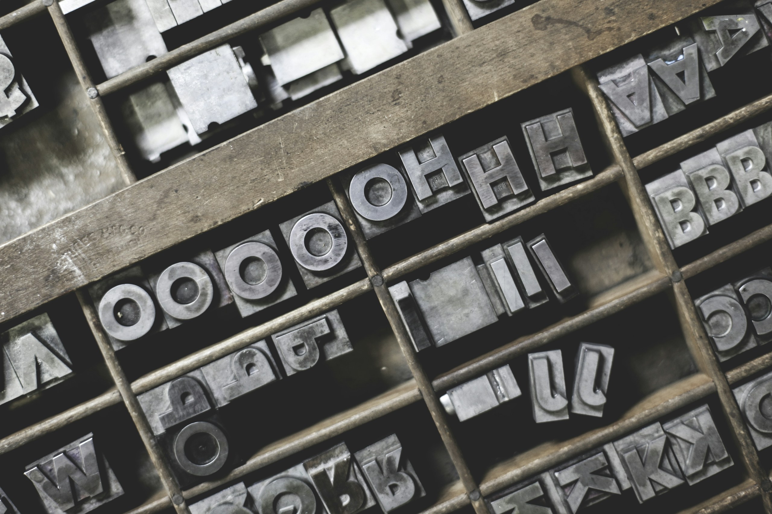
–print on paper is at 1200 or 2400 dpi, but current screens are only 100 dpi

–the software technology we use to draw letters has dramatically changed over the last 20 years, and this has improved the quality of text online, even though the dpi is still poor

–the goal of typography is “to be invisible”

–what rasterization and anti-aliasing mean in terms of making text more readable online

–how online reading specialists use color to “trick” our eyes into seeing a higher resolution

–why people who are colorblind will see text more clearly than people who are not

–what induces eye fatigue online

–when you are 40 years old only 1/2 of the light in your environment makes it through to your eye

and much much more!

And for more information on Kevin’s work at Microsoft you can also read his article on fonts and typography here.

This is the first in a podcast series I am working on. Let me know what you think!

Comments

28 responses to “Fonts, Typography, And How We Read Online”

  1. Scott Winterroth Avatar

    Interesting read, glad you brought this up. I think it’s the million dollar question right now as we want to shed print publications but don’t read online pubs.

    1. Leslie Carter Avatar
      Leslie Carter

      I wish I had a reference to a peer reviewed article or book where Kevin mentions that when you are 40 years old only 1/2 of the light in your environment makes it through to your eye. This is such an important fact for those designing for mature adults & I’d love to share it. I didn’t find any reference to it in Susan’s 100 Things book; did I miss it there?

      Thanks for that great work sharing research on psychology with designers.

  2. D Bnonn Tennant Avatar

    Hey Susan, great podcast, thanks. This is an area that particularly interests me, both because typography is a hobby of mine, and because so many designers get this stuff wrong.

    One thing: I think quoting a difference of ~100 ppi screen resolution compared to 1200-2400 ppi print is a bit misleading though. For one thing, most print is 300-600 ppi, not 1200-2400. For another thing, as the article you link states, you only really need 200-300 ppi for very legible text. And after 600 ppi, you really can’t tell the difference in most cases. So the gap isn’t as wide as it sounds…screens have maybe six times less resolution than printed media, at best. And of course, screens like the iPhone 4’s Retina display have >300 ppi resolutions, so there’s definitely no trouble with reading text on those. It’s only larger screens that have problems.

    Kind regards,
    Bnonn

  3. gef05 Avatar
    gef05

    Good stuff. Just been involved in a long and heated debate on this topic – excellent to see some expert analysis and opinion.

  4. nela Avatar

    wow! read this conversation summery! it makes me very curious to listen to the podcast aspecially about “why people who are colorblind will see text more clearly than people who are not” my mom is colorblind! :-)
    thank….

  5. Troy Avatar

    Great podcast!

    “when you are 40 years old only 1/2 of the light in your environment makes it through to your eye”

    Now I know why I can’t see like I once did :-)

  6. Mike Johnson Avatar

    Susan, just start reading your book, “Neuro Web Design”. Loving every minute. Thanks for your wisdom and inspiration. Mike

  7. […] age 40, only half the light gets through to the retina as it did at age 20. For 60-year-olds, it’s just […]

  8. 16 Pixels: For Body Copy. Anything Less Is A Costly Mistake | IdentityNepal.com

    […] age 40, only half the light gets through to the retina as it did at age 20. For 60-year-olds, it’s just […]

  9. […] age 40, only half the light gets through to the retina as it did at age 20. For 60-year-olds, it’s just […]

  10. 16 Pixels: For Body Copy. Anything Less Is A Costly Mistake | Ricky Noel Diancin Jr. Webmaster | Web Designer | Wordpress Expert

    […] age 40, only half the light gets through to the retina as it did at age 20. For 60-year-olds, it’s just […]

  11. […] age 40, only half the light gets through to the retina as it did at age 20. For 60-year-olds, it’s just […]

  12. […] age 40, only half the light gets through to the retina as it did at age 20. For 60-year-olds, it’s just […]

  13. wp-coder.net » 16 Pixels: For Body Copy. Anything Less Is A Costly Mistake

    […] age 40, only half the light gets through to the retina as it did at age 20. For 60-year-olds, it’s just […]

  14. […] age 40, only half the light gets through to the retina as it did at age 20. For 60-year-olds, it’s just […]

  15. 16 Pixels: For Body Copy. Anything Less Is A Costly Mistake | Blogs – NG Outsourcing

    […] age 40, only half the light gets through to the retina as it did at age 20. For 60-year-olds, it’s just […]

  16. 16 Pixels: For Body Copy. Anything Less Is A Costly Mistake | Testing themes

    […] age 40, only half the light gets through to the retina as it did at age 20. For 60-year-olds, it’s just […]

  17. 16 Pixels: For Body Copy. Anything Less Is A Costly Mistake – Just a blog :)

    […] age 40, only half the light gets through to the retina as it did at age 20. For 60-year-olds, it’s just […]

  18. […] age 40, only half the light gets through to the retina as it did at age 20. For 60-year-olds, it’s just […]

  19. […] age 40, only half the light gets through to the retina as it did at age 20. For 60-year-olds, it’s just […]

  20. […] themes go even smaller. And did you know that by the time someone hits 40, he or she will only be getting half as much light to the retina than somebody who is only 20? That means that the older your audience gets, the more difficult it […]

  21. […] easier on the eyes of older readers and persons with vision impairment. For a 40 yr old person, only half the light gets through to the retina as it did at age 20. For a 60 yr old person, that number is only 20%. […]

  22. […] Fonts, Typography, And How We Read Online – Susan Weinschenk […]

  23. smtp hotmail Avatar

    Muchas Gracias for telling us.

  24. Peter Drinnan Avatar

    At 47, I can say that reading is a joy, but not an easy a lot of the time, especially online. I was part of a group who built contrastchecker.com and we discovered a lot of interesting facts during that little project. One thing I didn’t know was that color blind people can sometimes find it easier to read some text.

  25. Donny Atienza Avatar

    Superb post. Greatly appreciate you sharing.

  26. Eric Avatar

    This is quite informative about font

Leave a Reply to nela Cancel reply

Your email address will not be published. Required fields are marked *